

Aconex | field
Aconex is now the most widely used online collaboration platform in the world for construction, infrastructure, and energy and resources projects. Aconex manage more than US$1 trillion in capital projects across 70 countries, serving over 70,000 user organizations. Allows owners, contractors, construction managers, EPCs, project managers and consultants to collaborate securely, efficiently and easily.
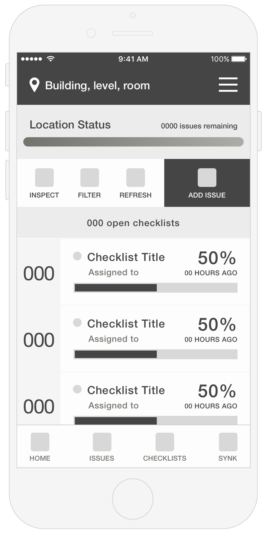
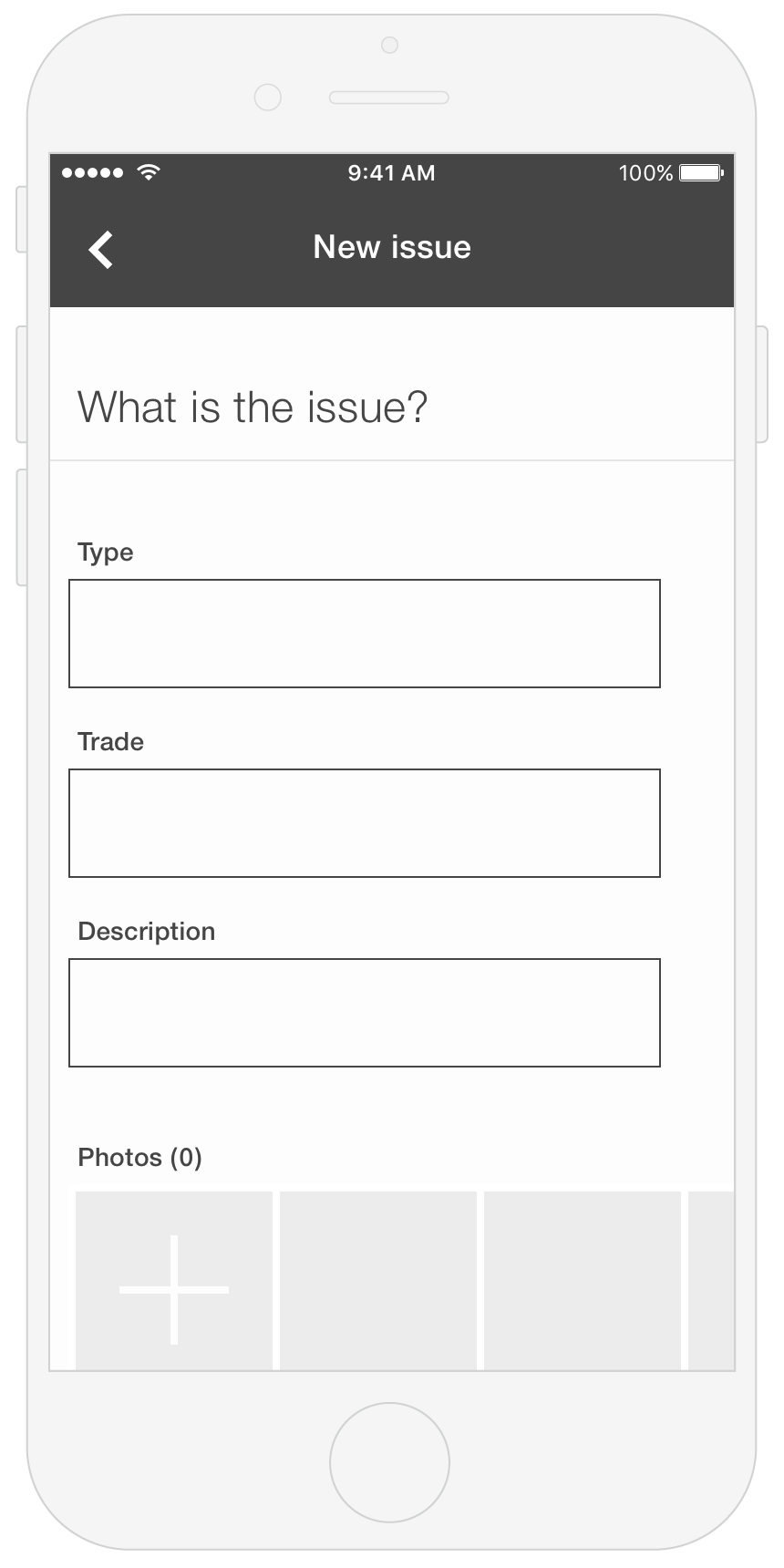
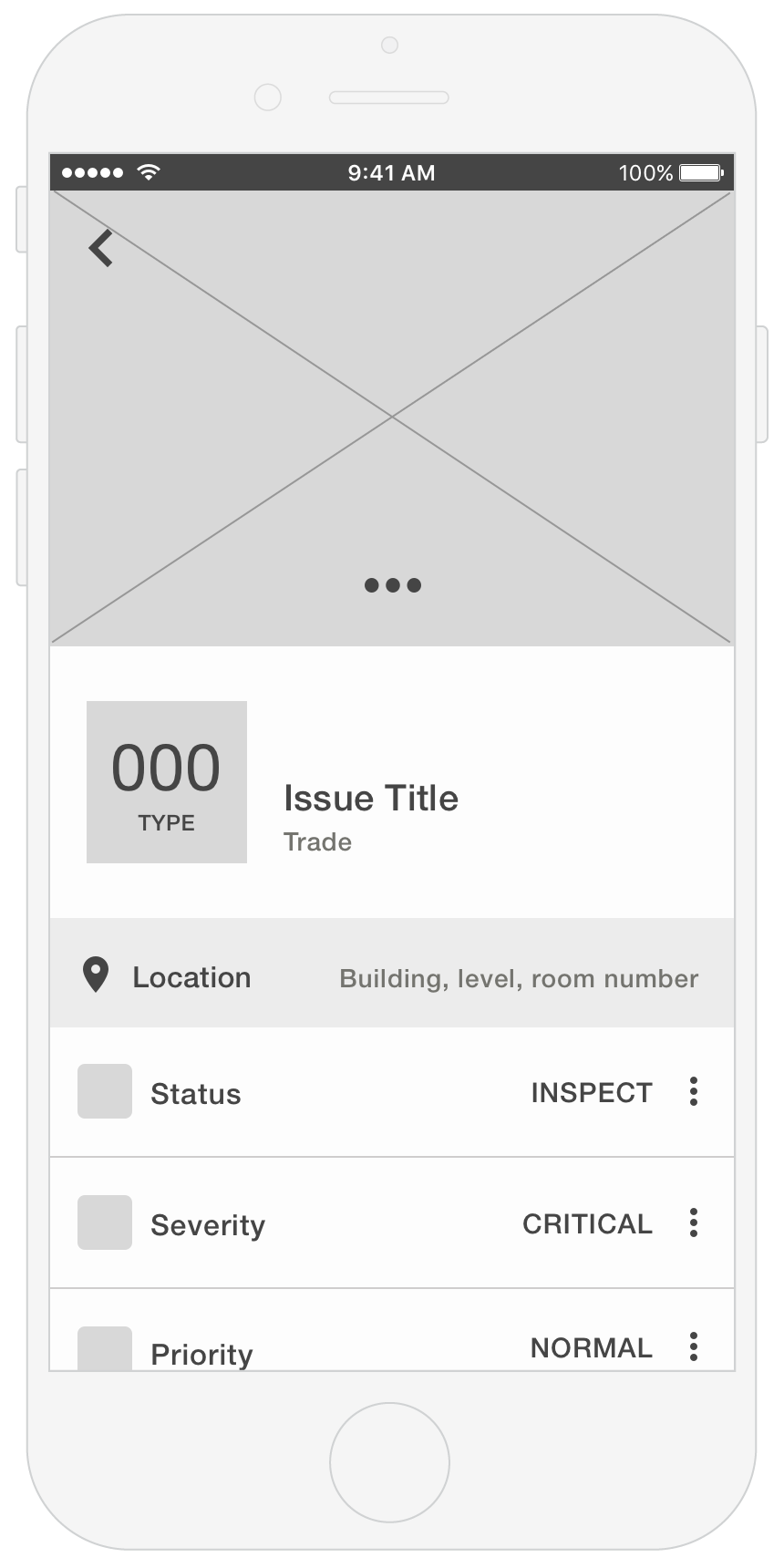
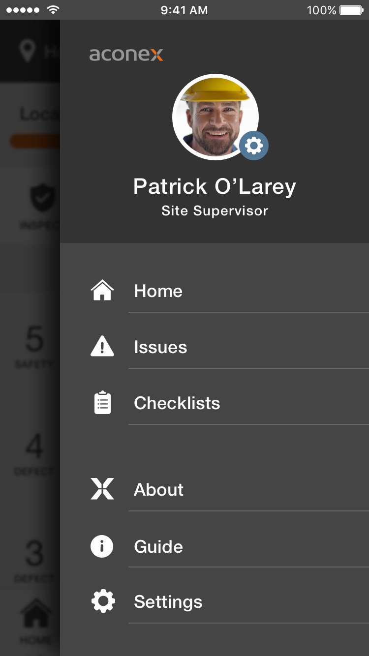
Aconex approached me with the challenge of improving their mobile app experience. The requirements were to create a new navigation between "Issues" and "Checklists" sections for a faster, intuitive and efficient interaction. Also to create a check-list results section and improve the process of raising, capturing, editing and classifying issues.
ROLE
UX Design
UI Design
Visual Design
YEAR
2017
RESEARCH
Wide Screens
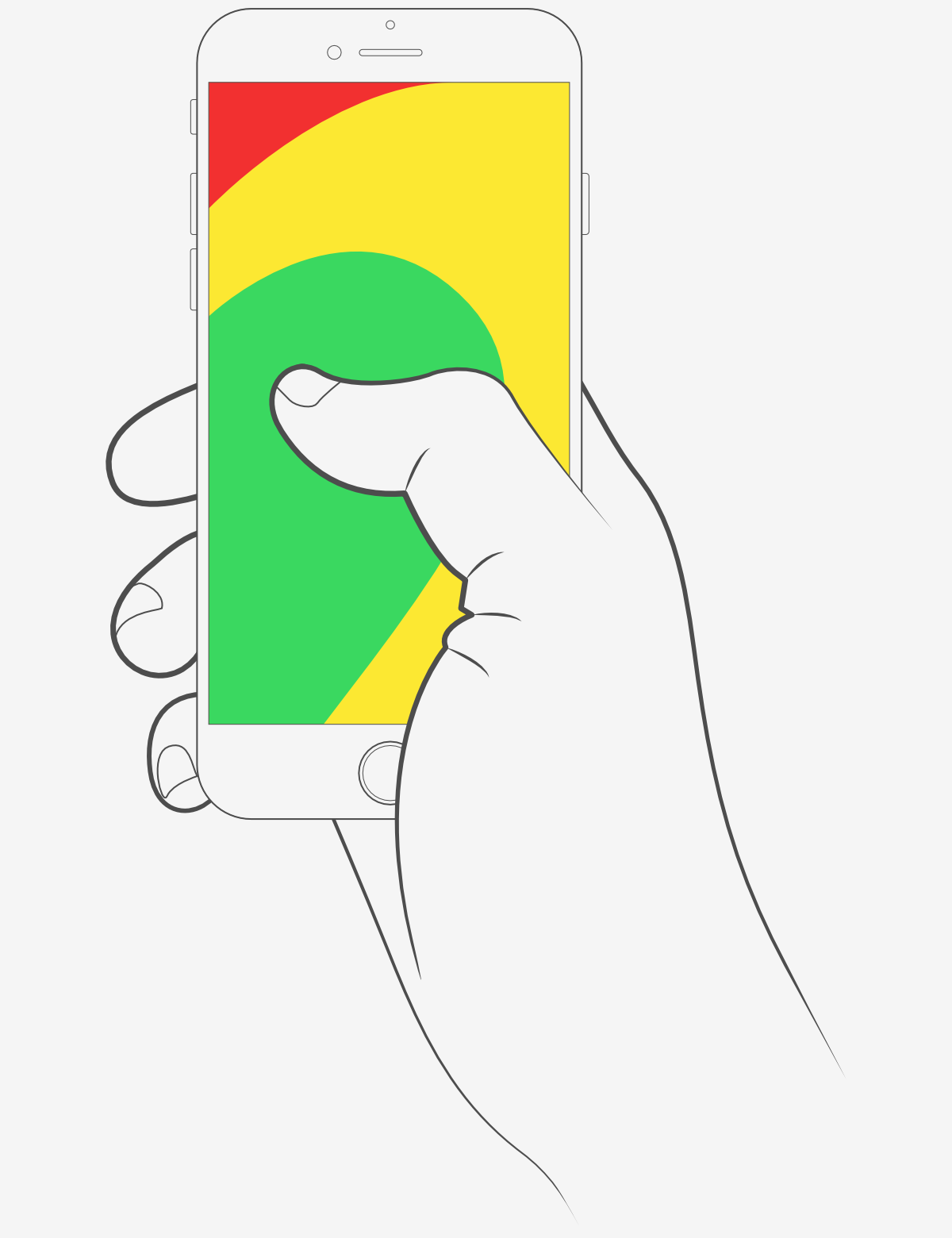
Nowadays the trend is to use wide screen mobile devices. According to Steven Hoober's research, 49% of users use just the thumb to interact with their smartphones. In figure below, the diagram that appears on the mobile phones’ screens are approximate reach charts, in which the colors indicate what areas a user can reach with the thumb to interact with the screen.
Green: users can reach easily; Yellow: requires a stretch; Red: requires users to shift the way in which they’re holding a device;
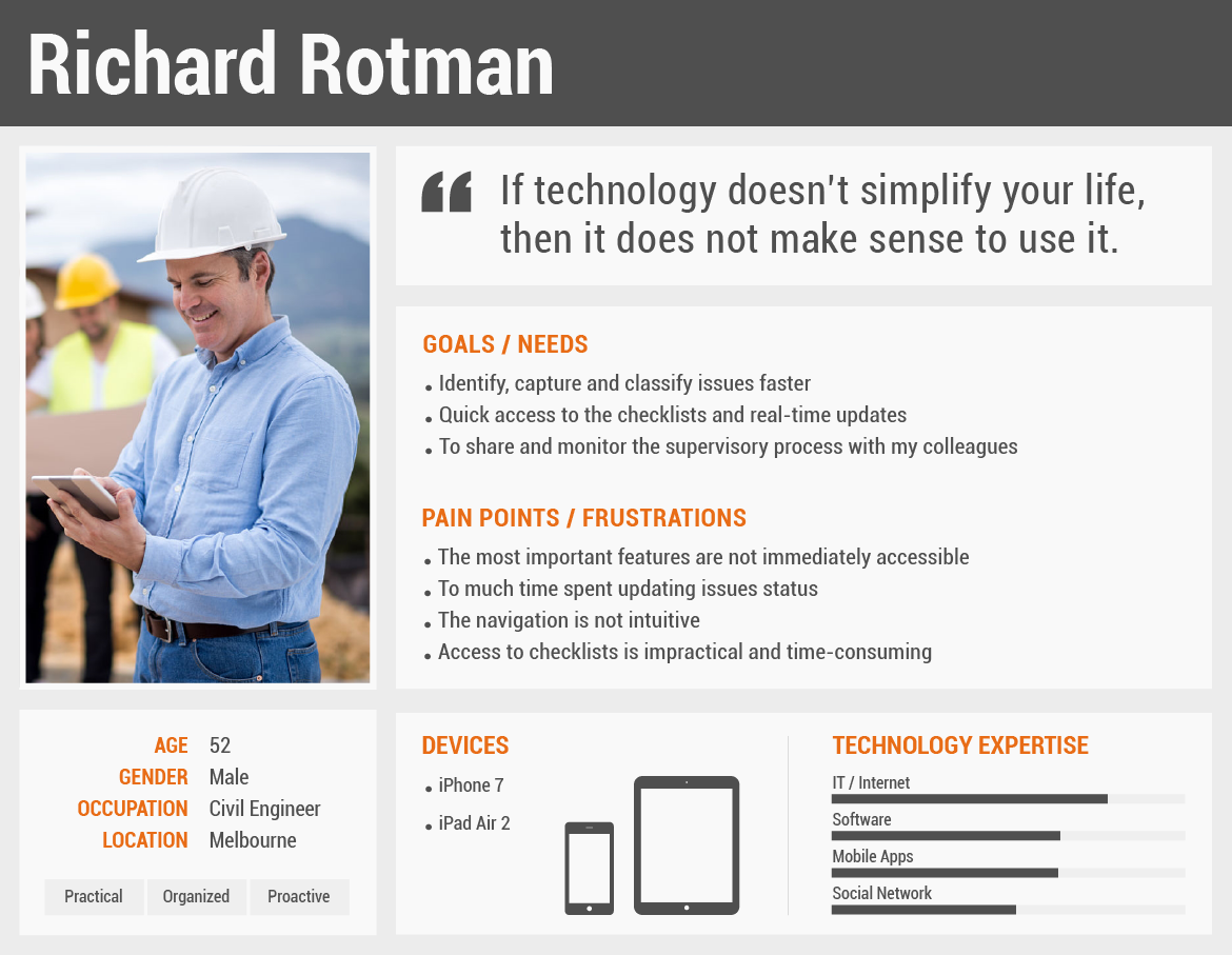
Our Users
By observing our users and understand their behaviour, motivations and pain points is essential to create better solutions.
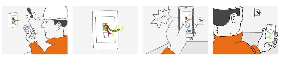
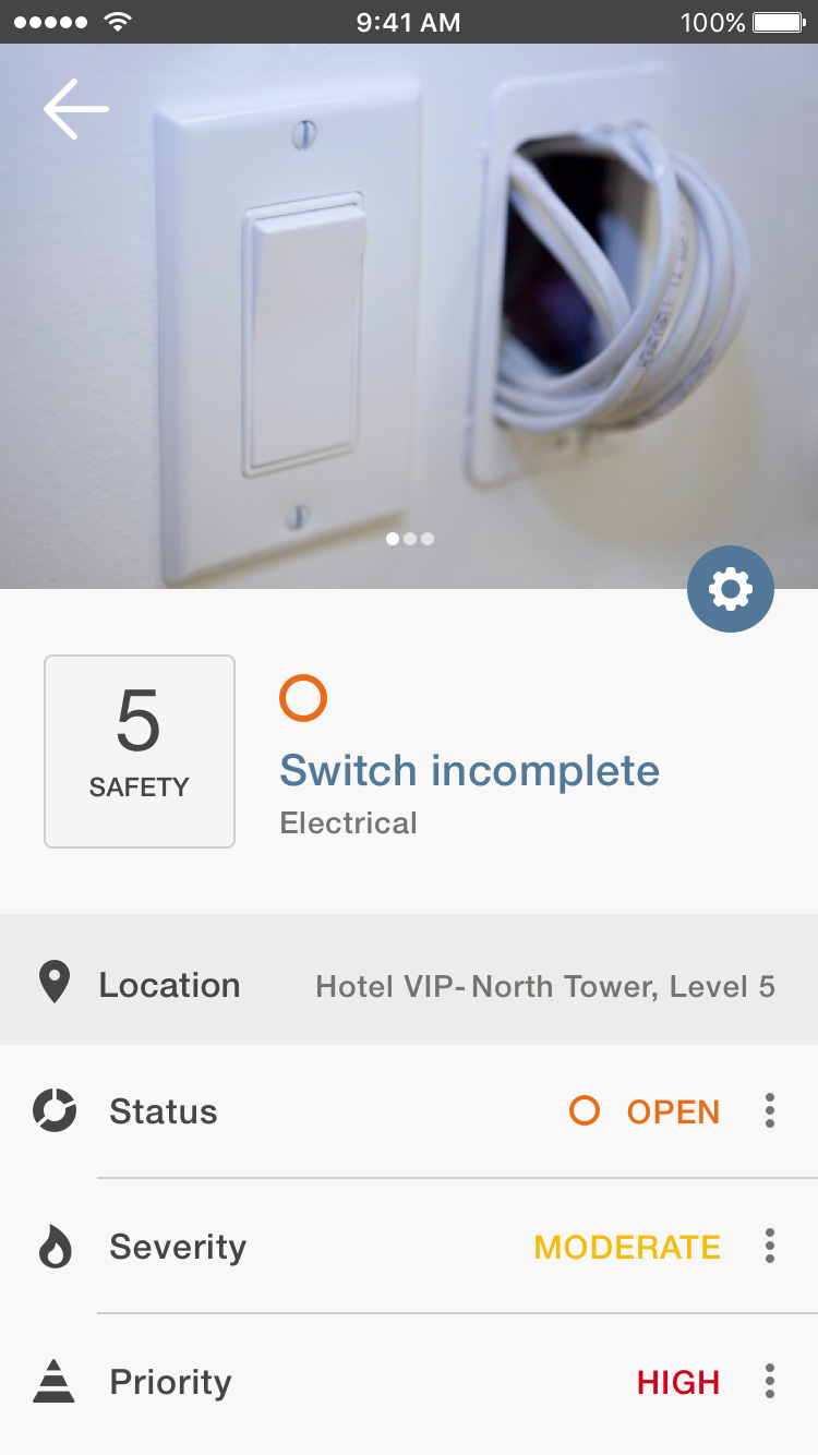
Inspector capturing an issue and sending for resolution.
APPROACH
Simple Fast Intuitive
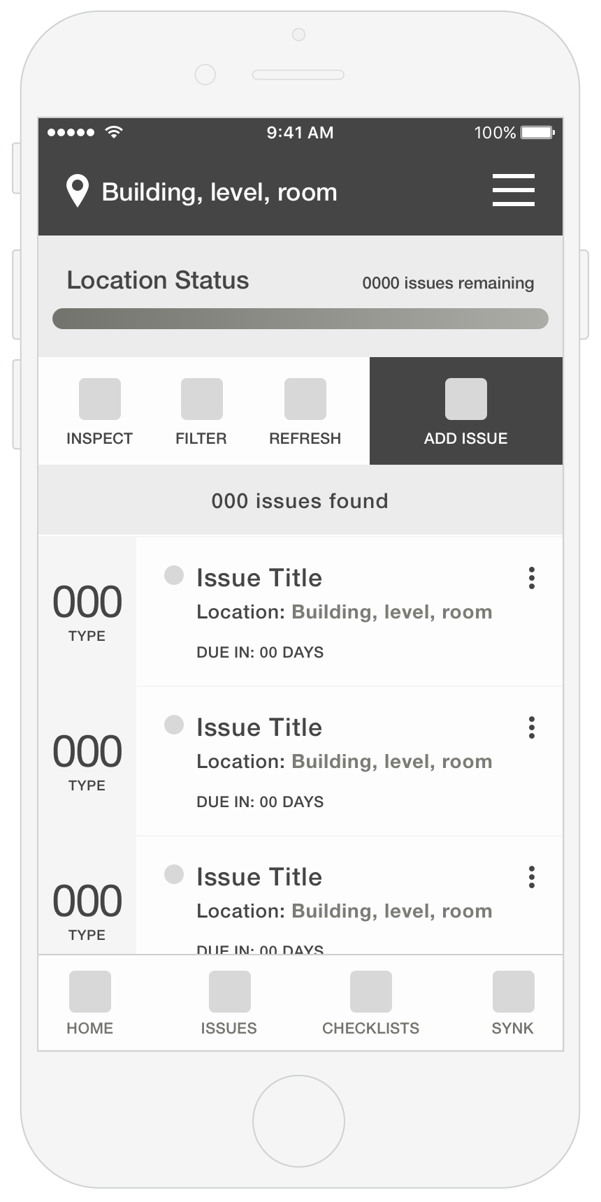
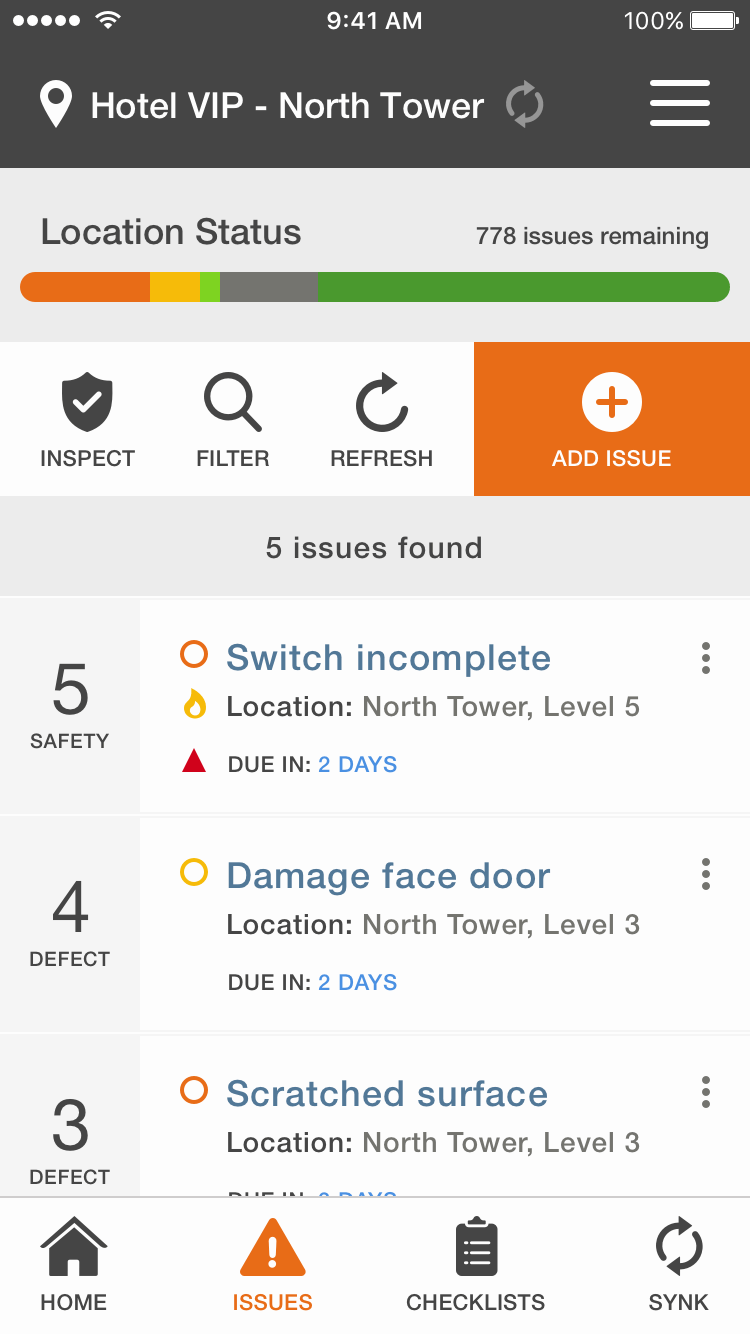
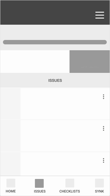
For this challenge I implemented two different navigations. A slide-out menu and a bottom bar. The slide-out menu allows the user to have full access to the application. However, if the user has a large-screen smartphone, to access this menu may break the flow of the experience. For this reason, I created a bottom bar with only the most important features. In this case, “Home”, “Issues”, "Checklist" and "Synk”. Accessing the bottom bar is simple, fast and intuitive and does not break the users flow.
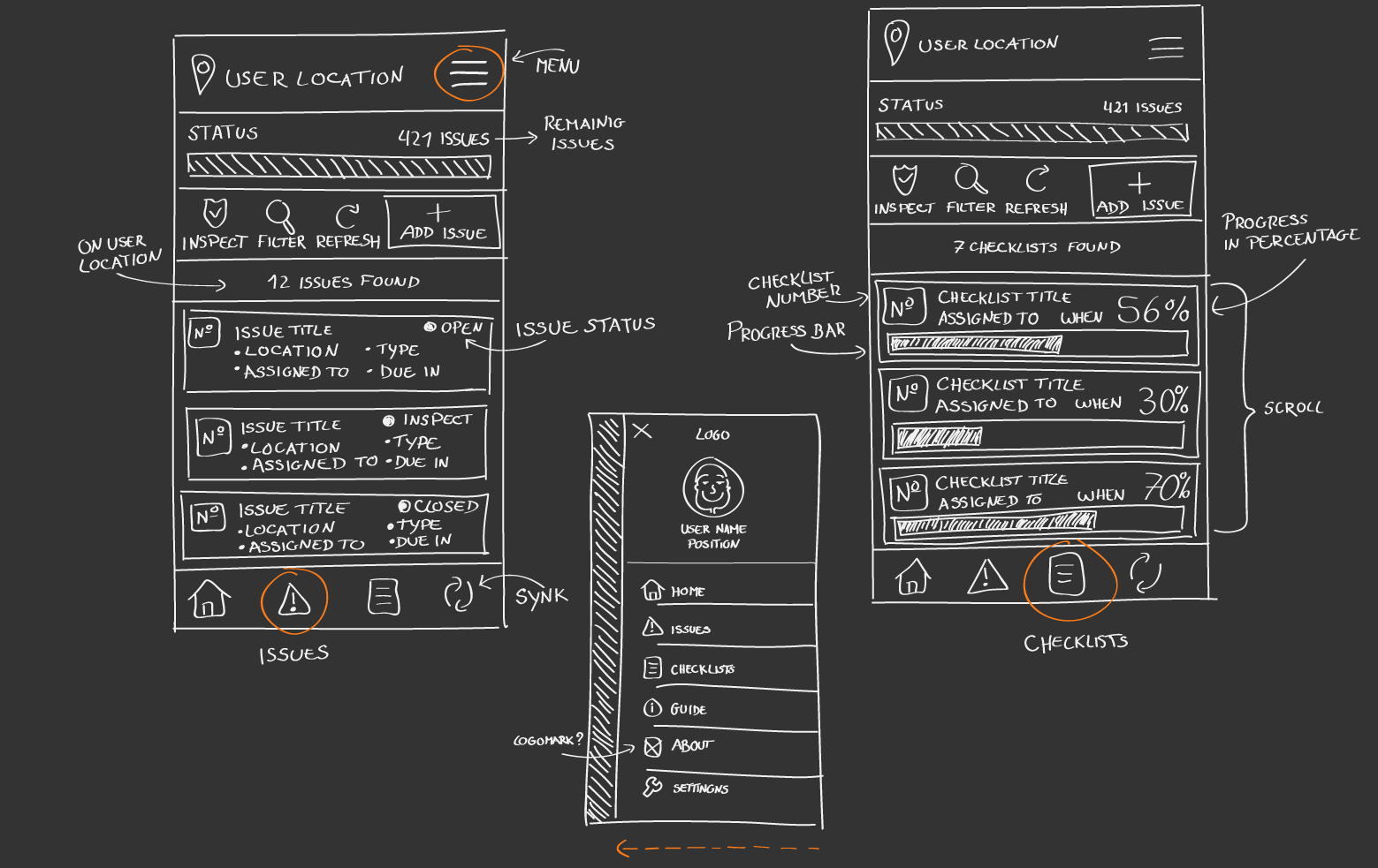
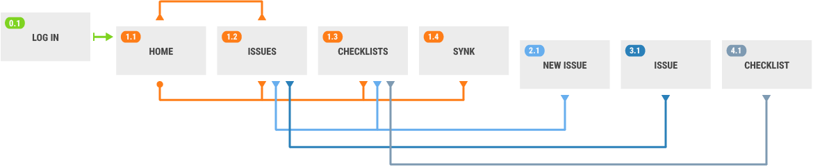
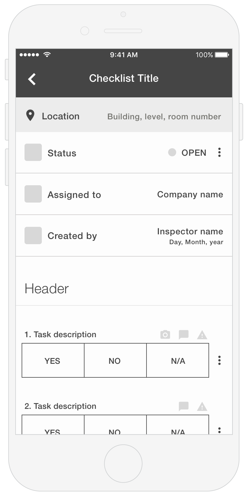
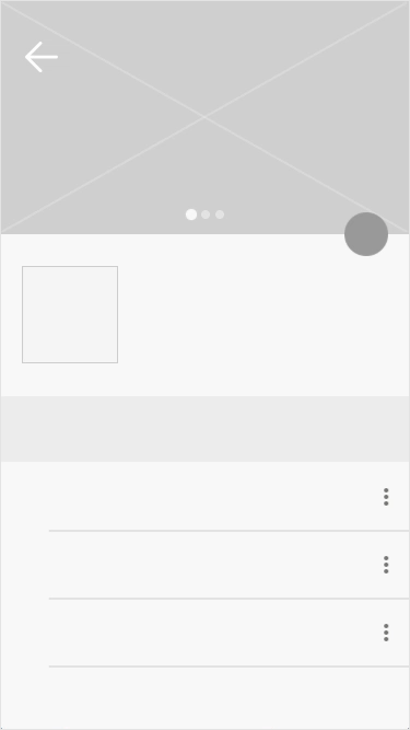
WIREFRAMES & USER FLOWS
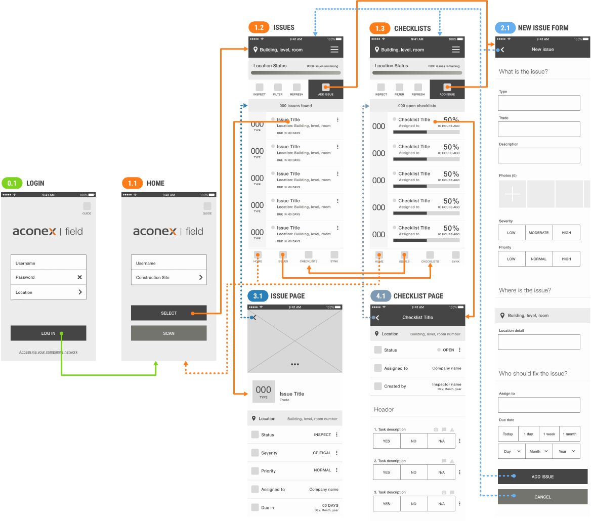
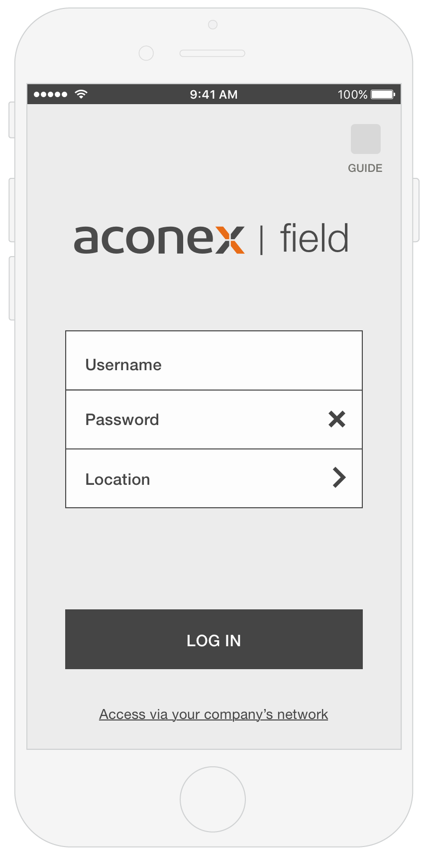
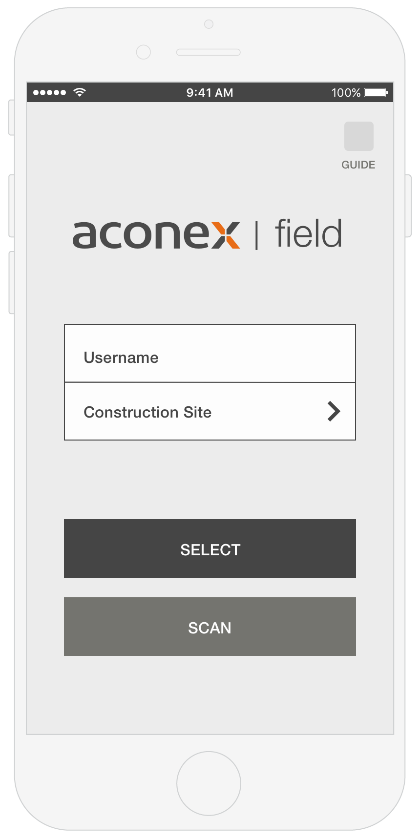
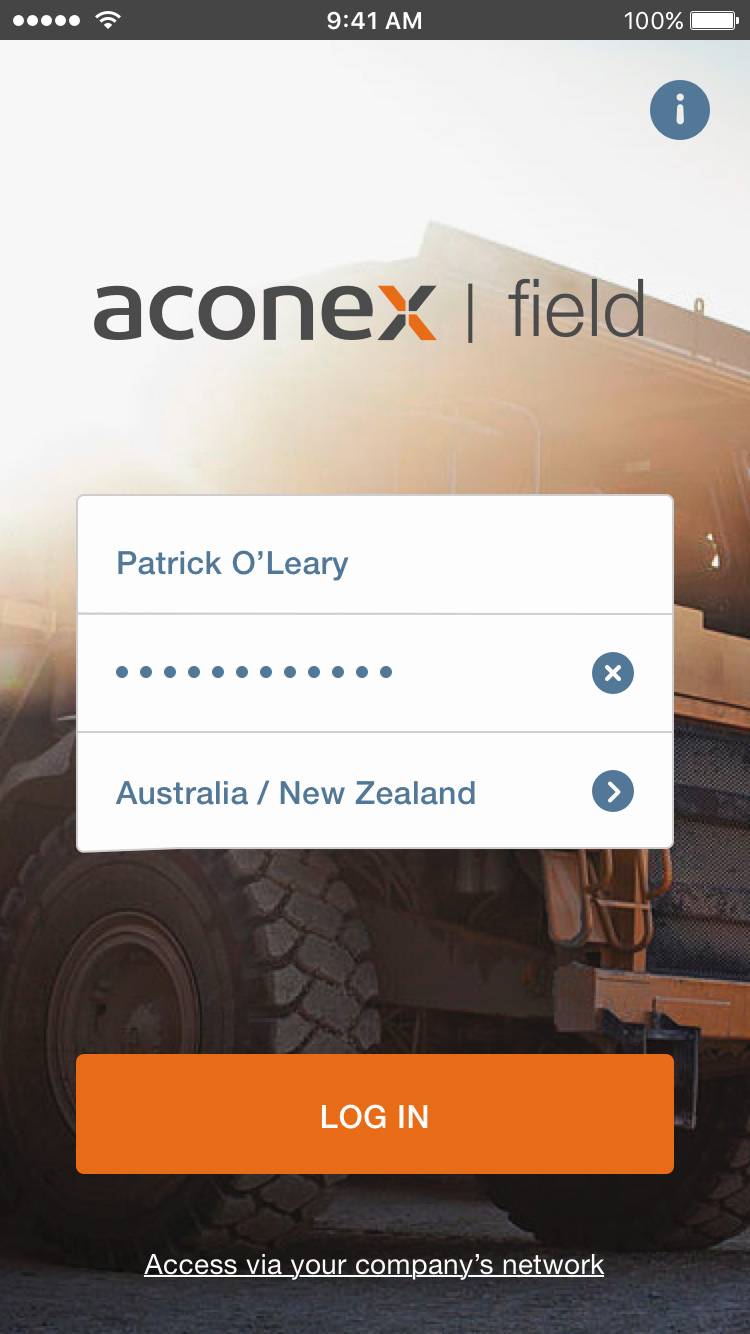
MOCKUPS
INTERACTION
Animated Transitions and Micro-Interactions
When a product is visually simple and minimalistic, adding some "flavour" to the animations and micro-interactions makes the experience more engaging. However, it is essential to keep it simple and intuitive without causing distractions or interruptions.


PROTOTYPE
© 2016 Cláudio Andrade